KPI Summary
KPI Overview
Once you've selected the KPI you want to view, your results will look something like this:
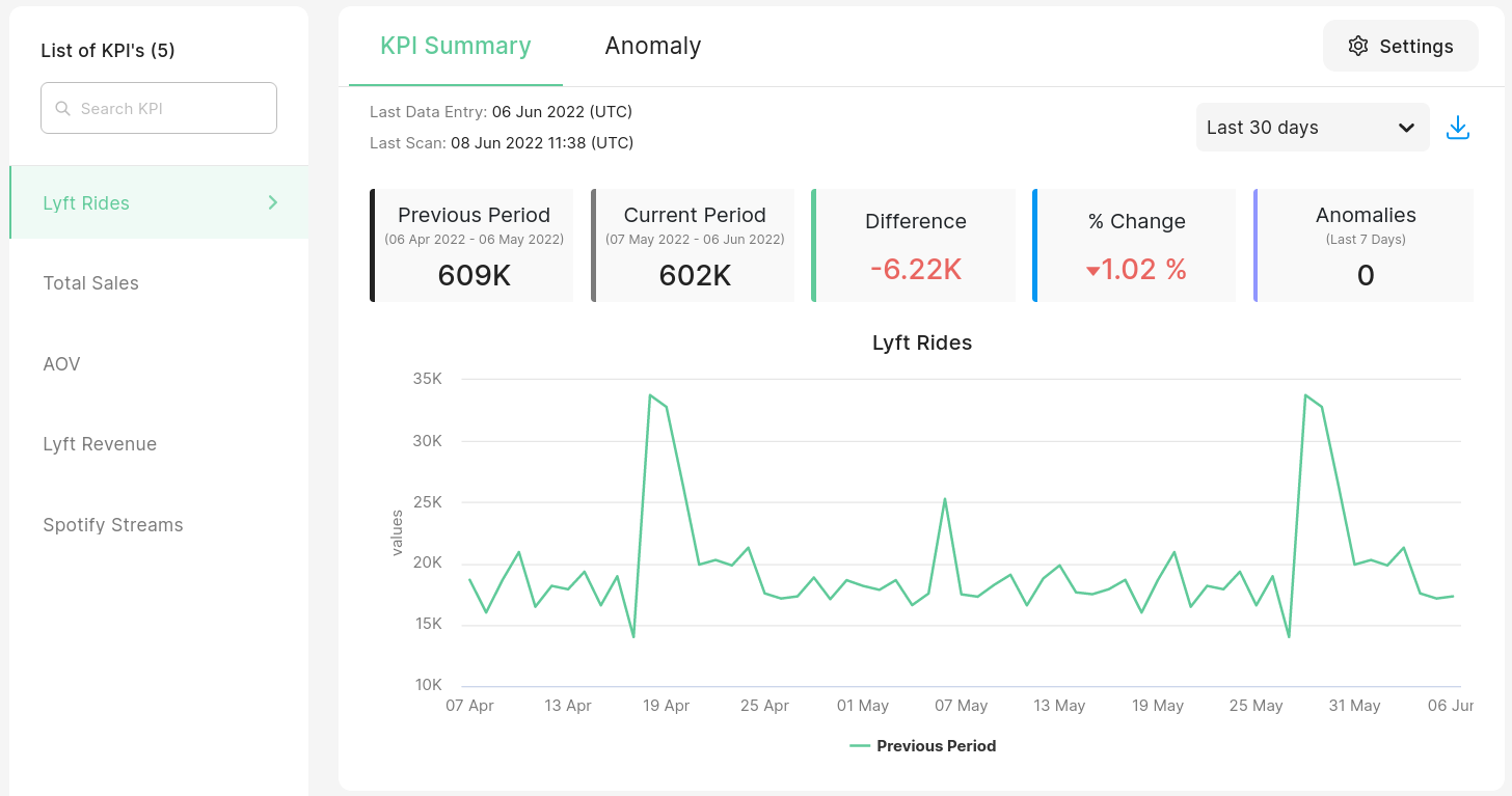
The KPI in this example is Lyft Rides When creating this KPI, it was set up to be a Sum aggregation of the num_rides column.
At the top, you'll see a summary of your KPI column represented with Summary Panel and a Time Series plot.
Summary Panel
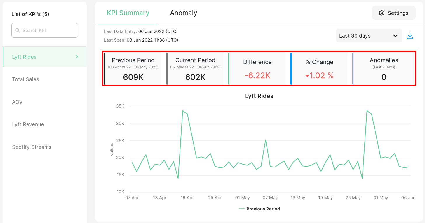
Chaos Genius produces a Summary Panel of your metrics from the KPI column and places them at the top for quick viewing. You can examine the values for both the current time range and the previous time range. We also provide a comparison between the two time ranges.
For example, here, we've selected our time range to be the Last 30 days. The total rides were 609K in the Previous Period (06th Apr 2022 - 06th May 2022) and 602K in the current period (07th May 2022 - 06th Jun 2022). You can clearly see that the rides decreased by 6.22K which is about 1.02%. The last card also shows the number of anomalies detected in the last week which can further help you identify changes.
Time Series Plot
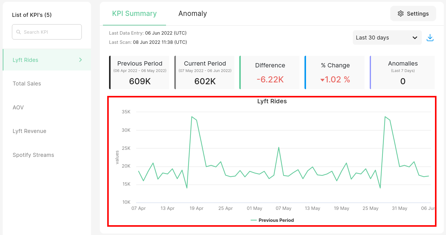
Chaos Genius will also produce a graph of your time series for the last 60 days which allows you to see the performance of your KPI over a period of time.
Changing the Time Range
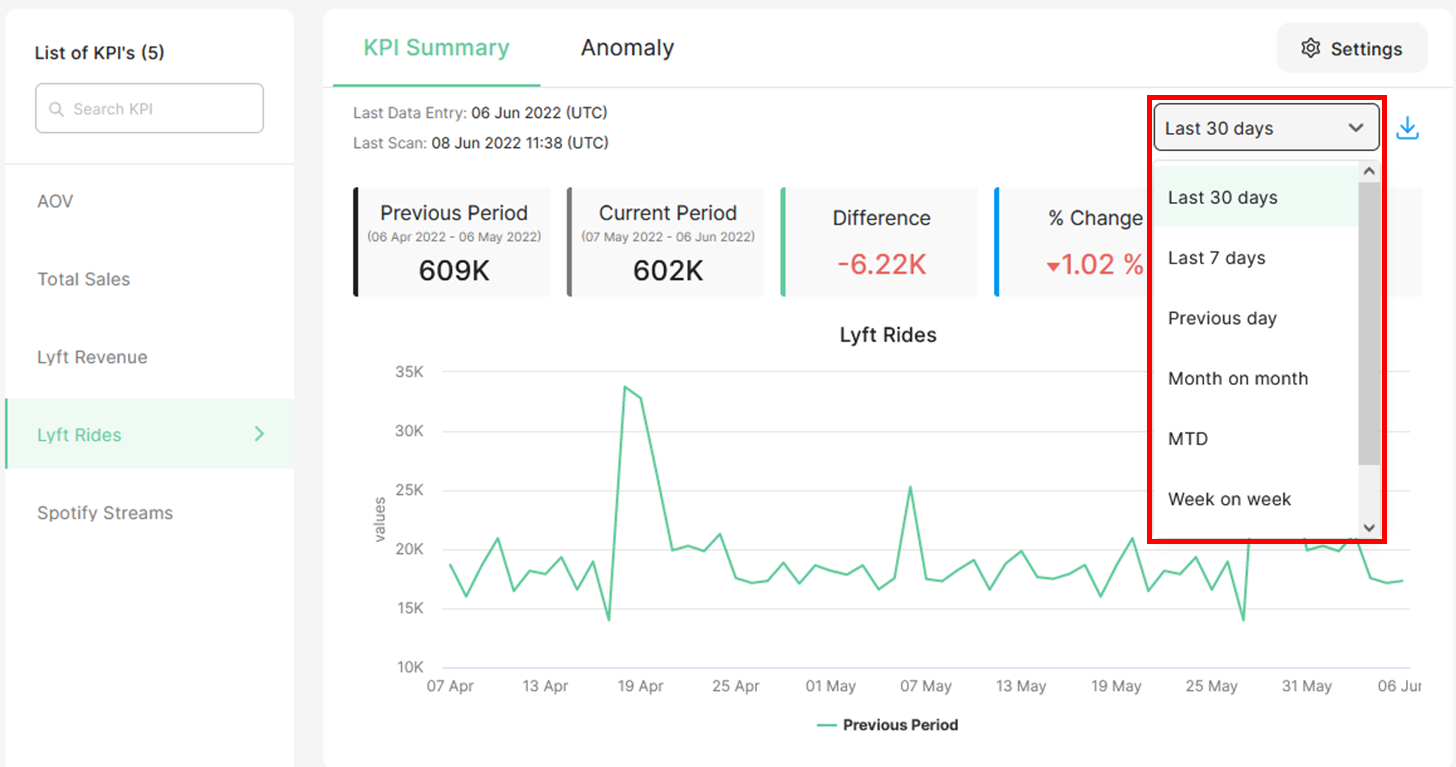
Using the Time range dropdown, you can select to compare groups in the time interval that you prefer.
The time intervals we currently offer are: Last 30 Days, Last 7 Days, Previous Day, Month on Month, MTD (Month Till Date), Week on Week, WTD (Week Till Date), Quarter on Quarter and QTD (Quarter Till Date).
Quarterly time-cuts are disabled by default. You can set what intervals you want using the SUMMARY_DEEPDRILLS_ENABLED_TIME_RANGES param in the .env file. For more information please refer to the Config Param Guide.